
The UK’s Local Inequality Problem: Big Debates, Bad Data
We talk endlessly about inequality, but the tools and data are fragile and misleading. Good local income data is missing - yet house price proxies, small-area models, and AI offer ways forward.

I still remember the first time my high school economics teacher drew a Lorenz curve on the board. Inequality looked so clean, so measurable, so obvious. By the time I was doing my undergrad in economics at Erasmus University Rotterdam, I was sitting first row when Piketty came to give a guest lecture on campus - I was convinced (once I realised ‘r>g’ wasn’t just his French way of pronouncing ‘reg’). Fast forward to the research I’m currently involved in, and the reality couldn’t be further from the truth: the data is messy, the measures disagree, and at the local level in the UK it’s often a disaster. A national Gini gives you the “big picture,” but people don’t live in national averages. They live in neighborhoods, towns, and regions - but for local data surveys are too small. Tax data is locked away. Administrative sources are incomplete. Every time you think you’ve found a dataset, it turns out to be missing exactly what you need…
So how do you measure local inequality in practice? Measuring inequality sounds easy until you try doing it locally - and over time. The World Inequality Database gives national snapshots, but below that the data thins out fast. Which sources can we actually trust? Which measures hold up?
I think it’s fair to say that measuring inequality is itself unequal. Let me explain.
Sensitivity to Data Sources
The UK doesn’t ask residents about income or wealth in the census. That means we lack the kind of granular, universal data you’d want to measure local inequality properly. Surveys are too small at the local level and underreport the rich, and administrative records are incomplete (many households never file tax returns and the informal sector is left out).
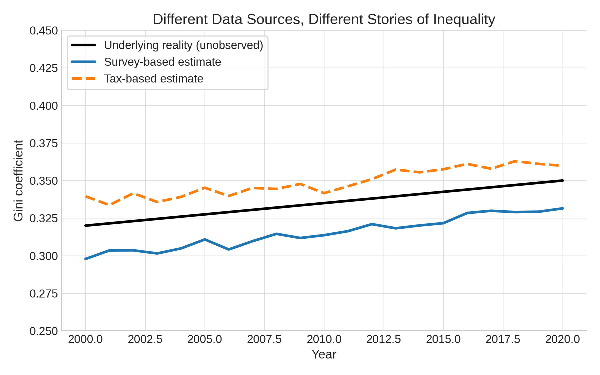
In short: garbage in, garbage out. Below, with simulated data I show that inequality looks very different depending on the data source. Household surveys (blue) understate top incomes and show a flatter trend. Tax data (orange dashed) captures the top better and suggests inequality is rising faster. The underlying “true” inequality (black) is never directly observed. The choice of dataset alone can change the story.
Data quality
As you know from the previous rants of mine (see The quiet collapse of surveys: fewer humans (and more AI agents) are answering survey questions & The Quiet Collapse of Surveys Part II: adding some nuances), even if the data is there, the reliability due to low response rates can be questioned. Survey response rates in the UK have collapsed since before the pandemic - from around 50-60% down to 20-30% for major surveys like the Labour Force Survey. That matters. The missing respondents aren’t random. The rich are less likely to respond; the poorest are harder to reach. This skews the distribution, making inequality look more muted than it often is. Add in risk of misreporting or AI/bot responses, and you have a data problem that goes beyond just missing values.
Recently, the UK’s statistical agencies even had to delay or revise key publications due to quality concerns. For example:
The ONS recently postponed its retail sales release citing quality issues.
Its Labour Force Survey (LFS) response rate is still well below pre-pandemic levels, and reforms in survey methods are underway - but full reliability isn’t expected until 2027.
Official wealth data lost its “accredited status” due to concerns over declining response rates and survey reliability.
Time Comparability Issues
Tracking inequality over time is harder than it looks. Survey methods change (e.g. the UK’s Family Expenditure Survey → Living Costs and Food Survey). Tax reforms alter what’s counted as “income” (capital gains, pensions, self-employment). These breaks in series often get swept under the carpet, but they can radically alter long-run trends.
Focus mostly on Income, not wealth (or consumption)
Most inequality stats are income-based. But inequality in wealth is far higher, and much harder to measure. Alternatively, consumption may be closer to welfare - but consumption data is thin, outdated, and often unreliable. So when we talk about “inequality,” we’re really talking about one slice of the pie.
Too Many Measures, Too Little Agreement
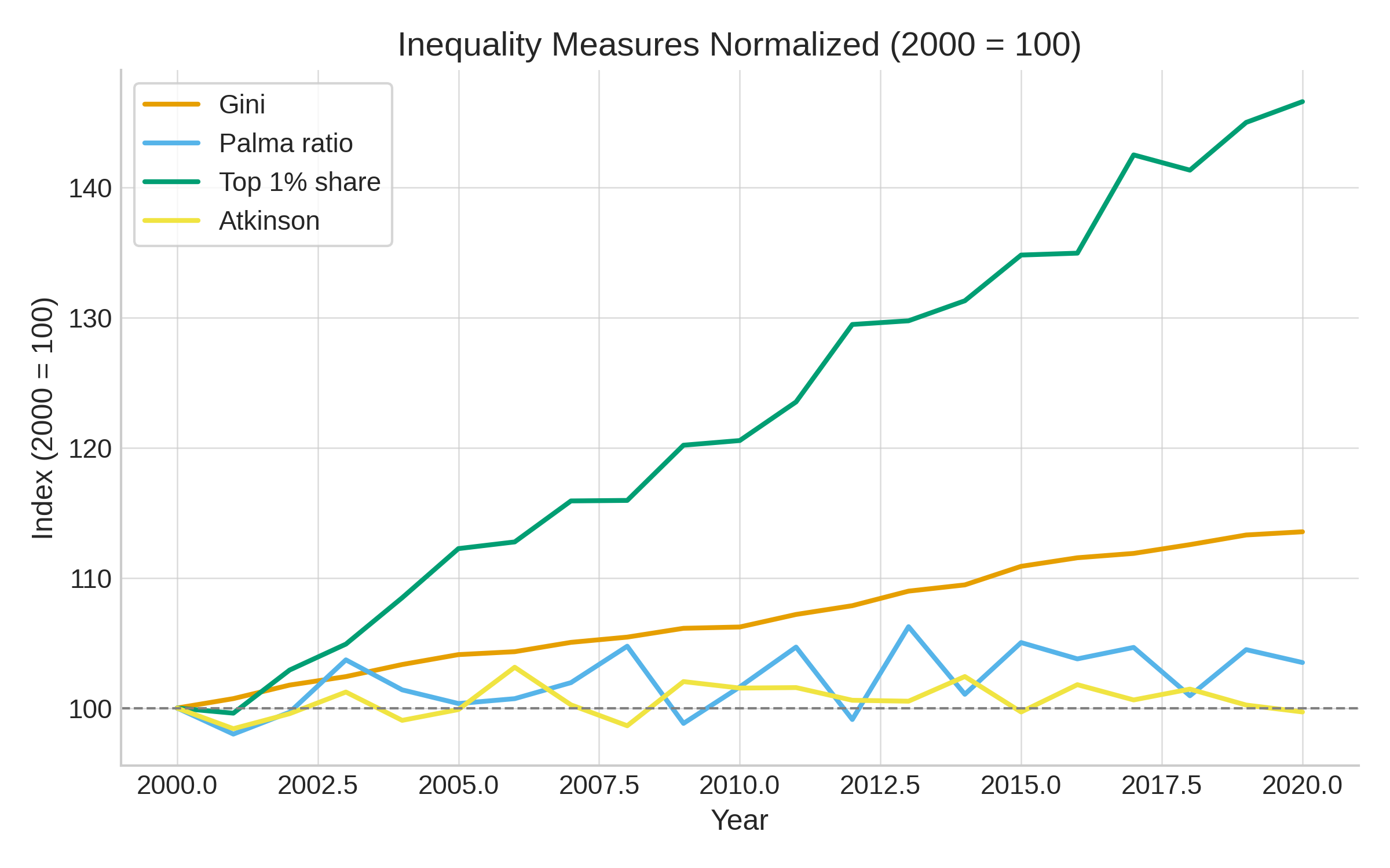
Then, assuming we have data, we need to use it wisely. Economists love indexes - Gini, Theil, Palma, Atkinson - but they don’t agree. One measure says stable, another says inequality is soaring. See below a little simulation: normalising inequality measures shows how differently they evolve - the Gini is steady, Palma and Atkinson barely move, while the top 1% share surges, underscoring how the story depends on which metric you choose (a fact that politicians know very well…).
Inequality vs. Poverty vs. Affluence
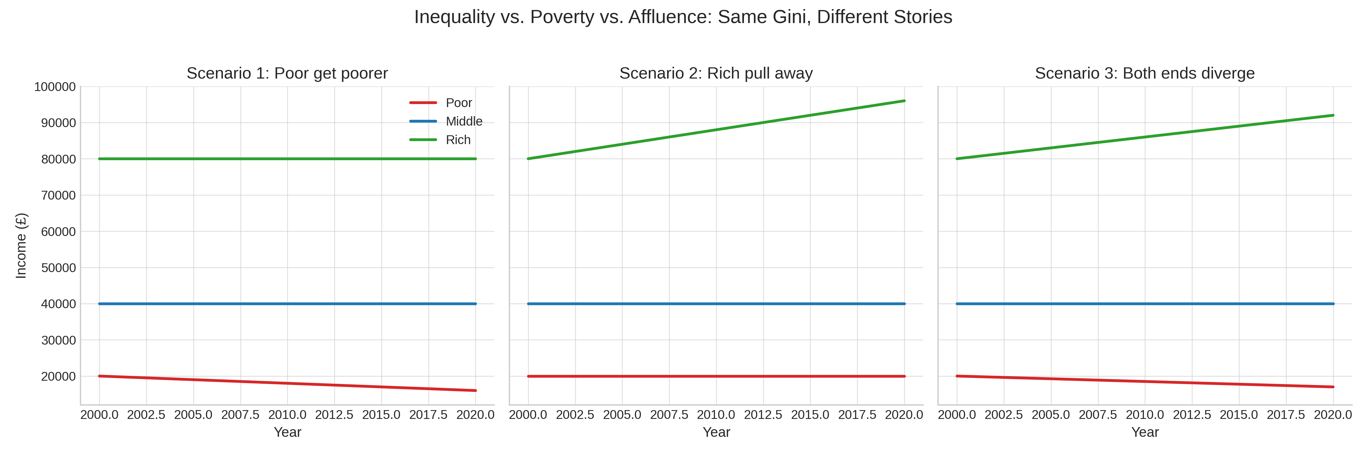
Even if we set on one measure, a change in the measure can mean different things. For instance, a rising Gini can mean: the poor got poorer or the rich pulled away. Or both. But most measures don’t distinguish. That makes them blunt instruments for understanding social change. Below three scenarios that mean that provide similar Gini coefficients with different underlying stories:
Ignoring Composition Effects
Who counts as a “household” or “unit” matters. Migration, aging populations, more single-person households - all these shift inequality measures even if underlying distributions of resources stay constant.
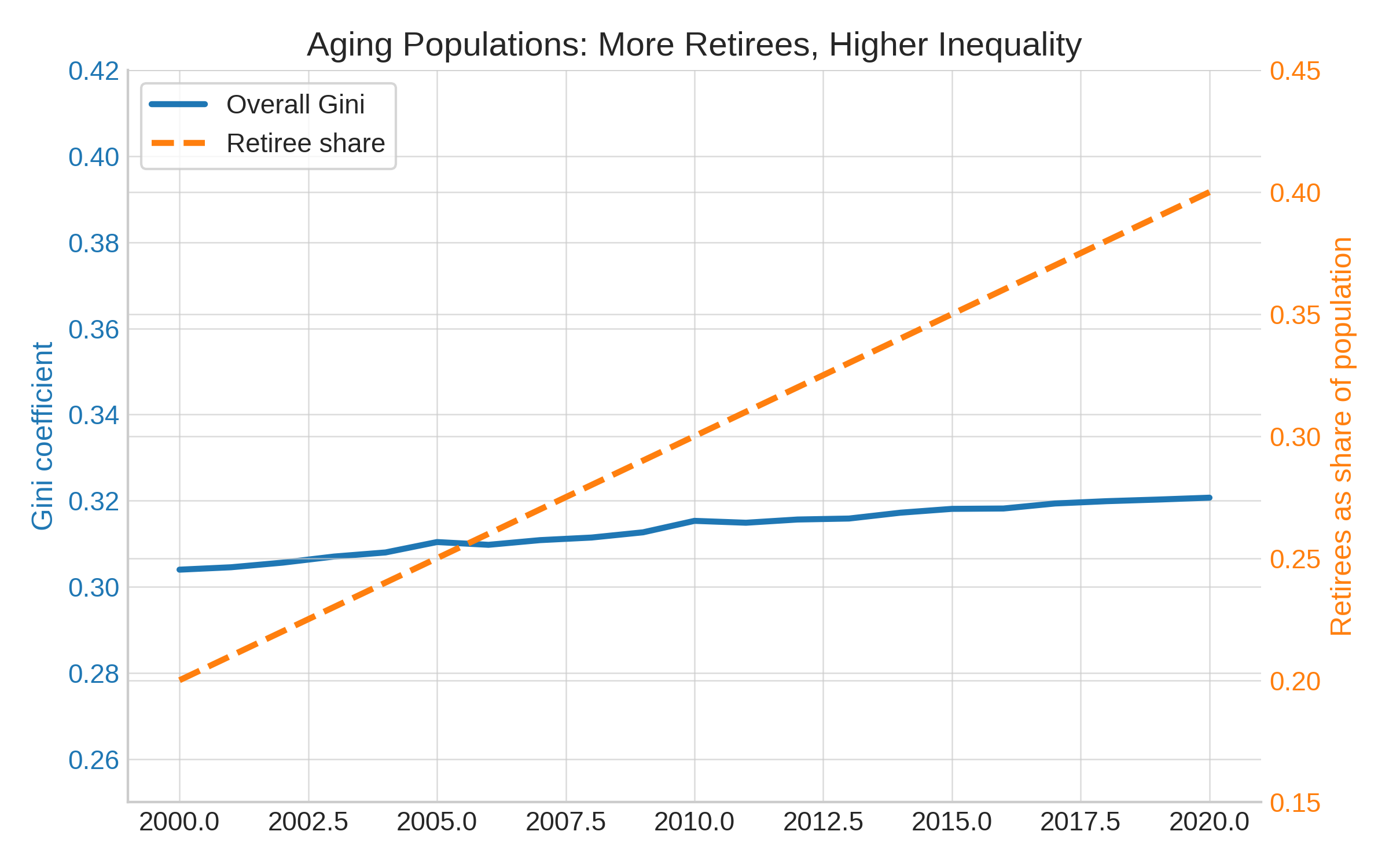
Let’s take the aging populations: more retirees means higher inequality: suppose workers earn around £40k and retirees around £20k. Within each group, incomes stay constant over time. But as the population ages and the share of retirees doubles, the overall Gini coefficient rises - purely because of demographics. Below a simulation with dummy data:
A second-best analysis: local UK inequality over time
So, what to do? Give up? Not quite.
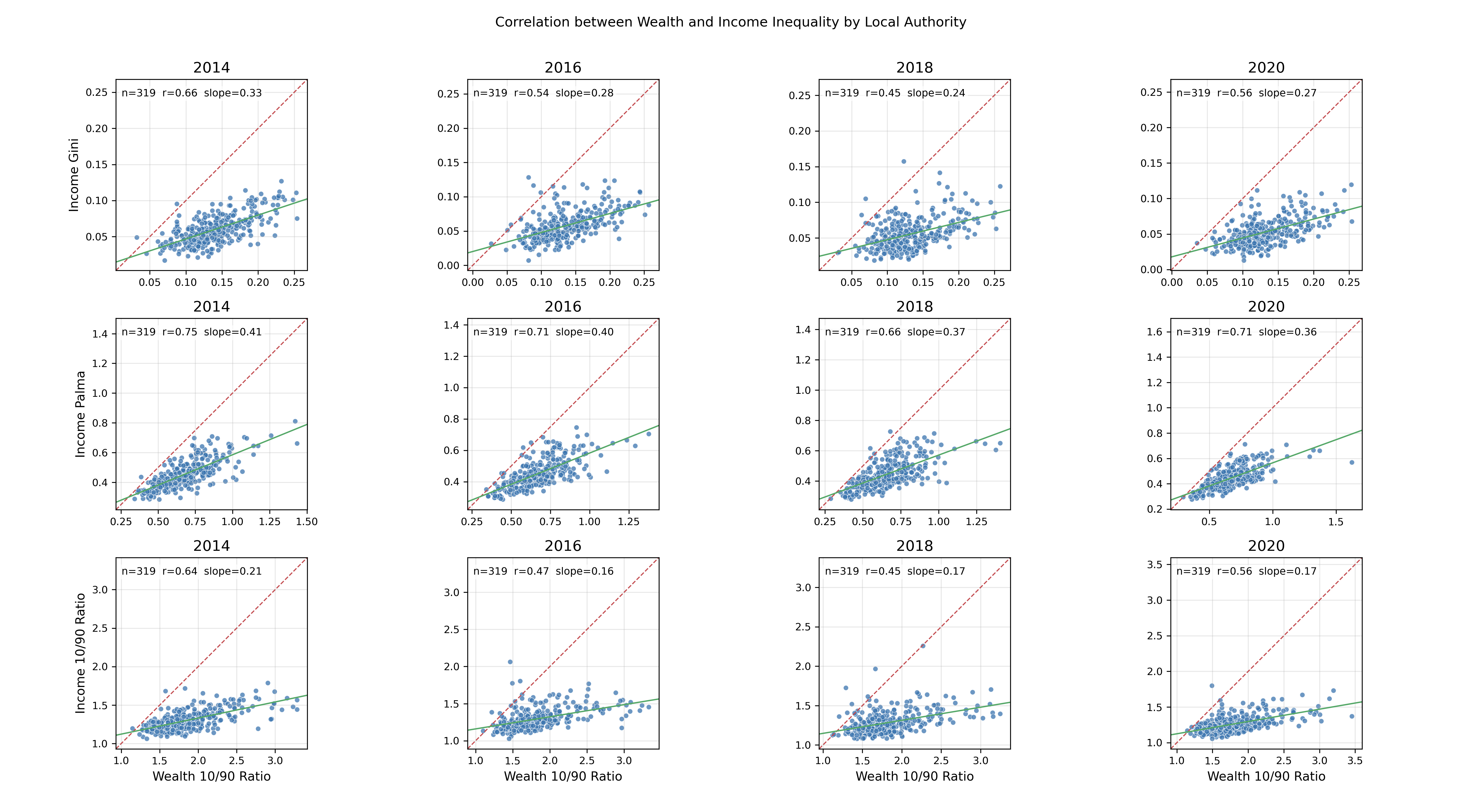
But I did my best with what I had and created a measure of income inequality and wealth inequality exploiting MSOAs being embedded into local authorities as the source of variance. For income inequality, I leaned on the best ONS data available, though only for a relatively short period (2014-2020). For wealth inequality, I used house price distributions - a surprisingly strong proxy, thanks to the Land Registry’s exhaustive coverage of every property transaction since 1995.
The figures below show the change over time at the Local Authority Level for income (top) and wealth (bottom). Once you start comparing indices - Gini, Palma, 10/90 ratios - the picture fragments. Sometimes the Gini is flat, while the Palma or the 10/90 ratio suggests growing divides. This isn’t just academic nitpicking: it shows how easy it is for policymakers to pick whichever statistic best supports their argument.
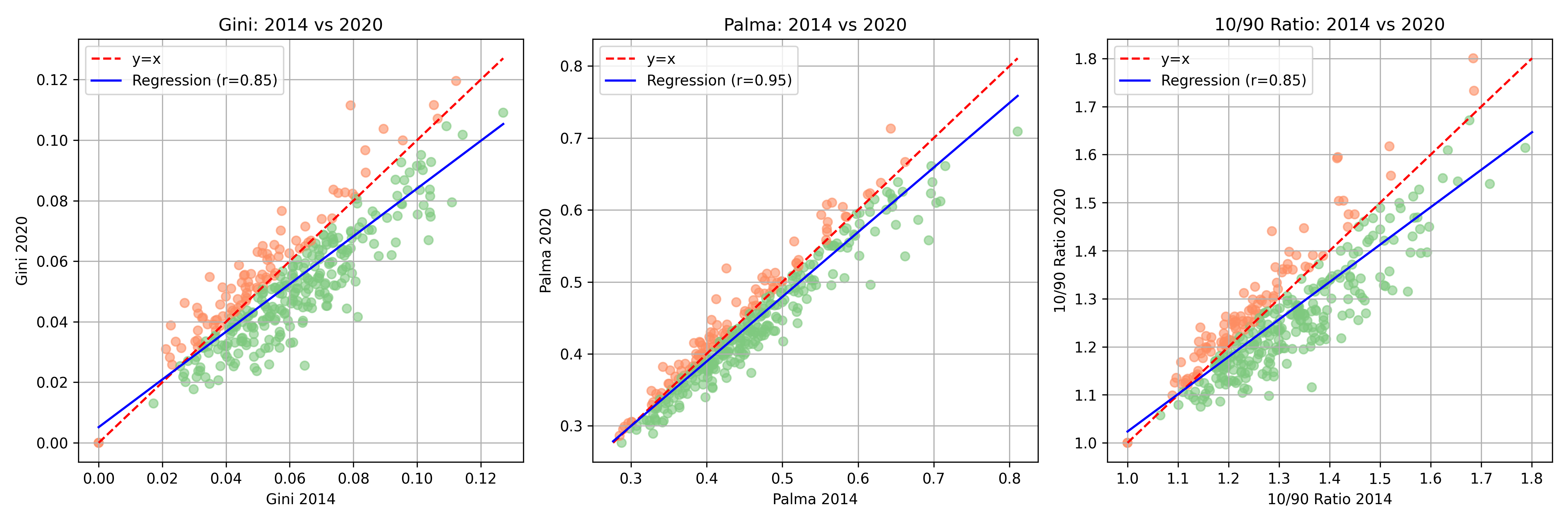
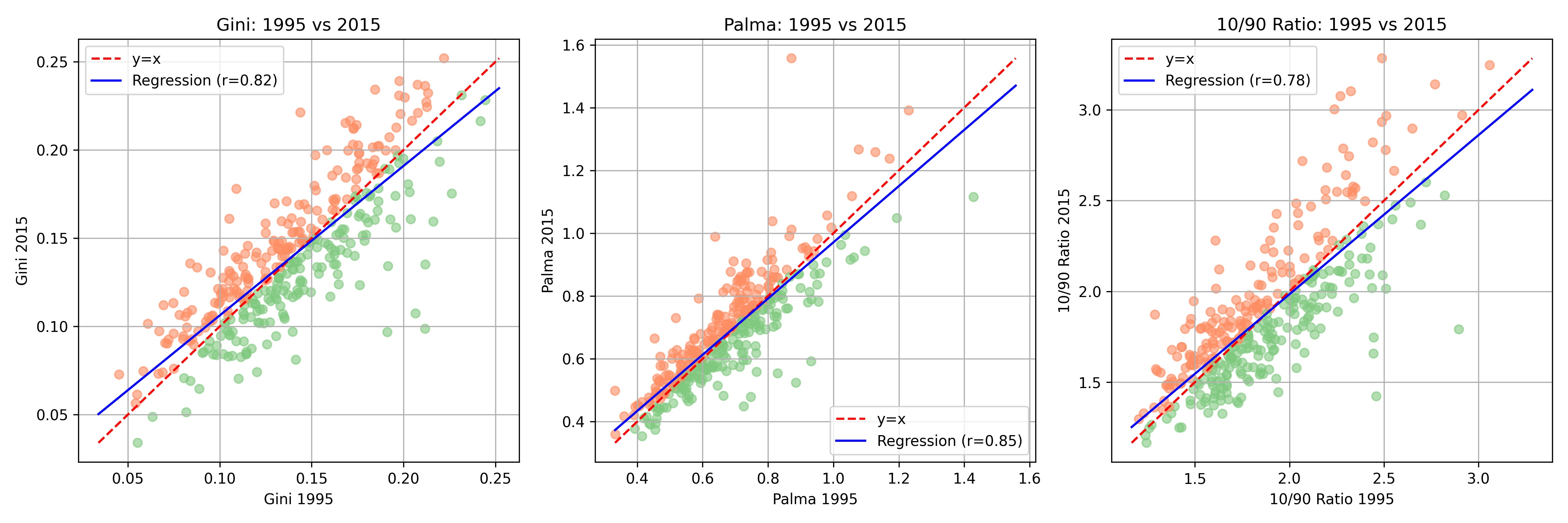
How do these measures compare over time? Across 2014-2020, local wealth and income inequality are positively correlated, but wealth measures consistently run higher and diverge more strongly over time, showing that where you live often looks more unequal in assets than in income.
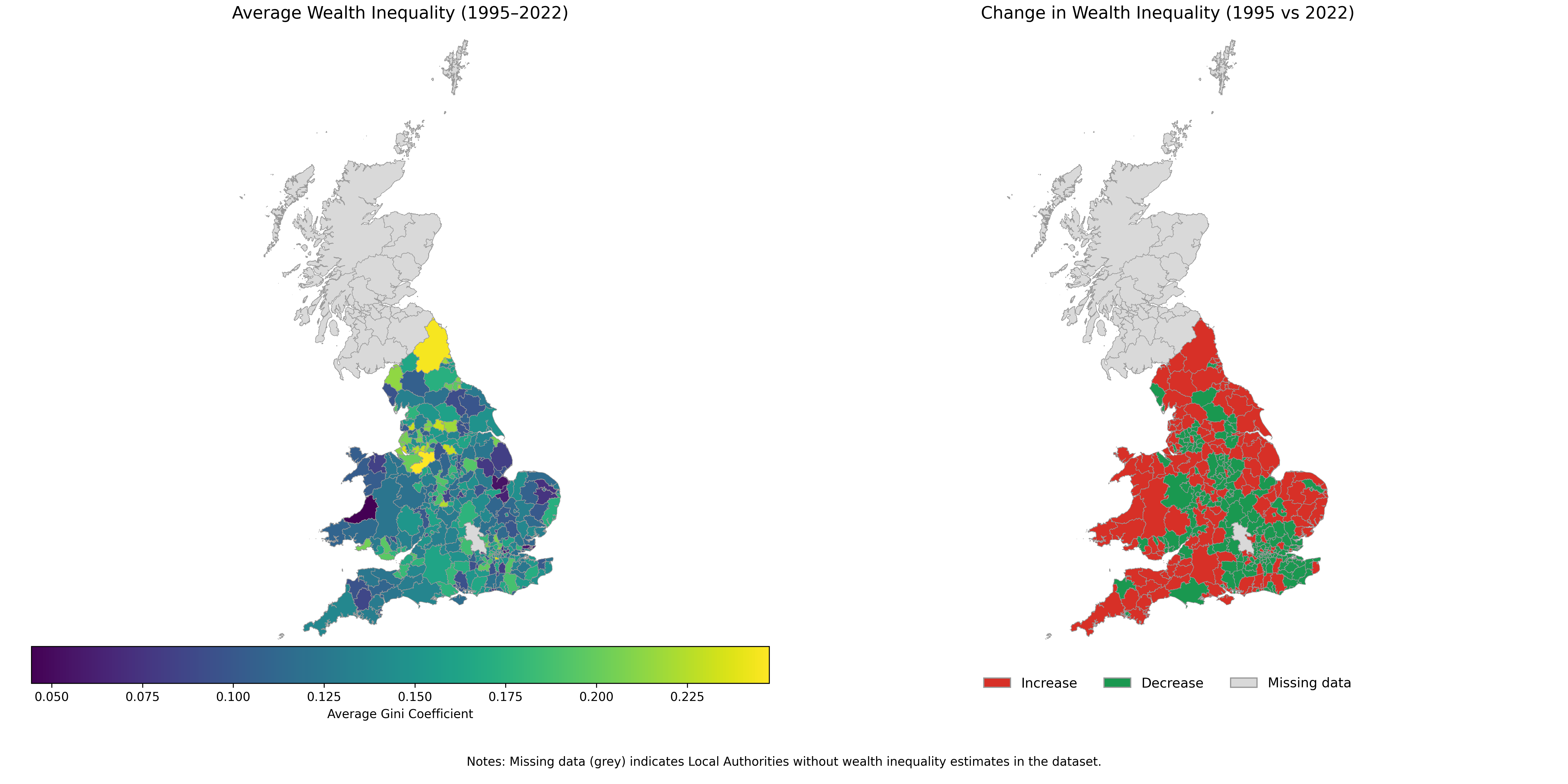
When mapped geographically, local wealth inequality reveals striking variation across England and Wales. Some local authorities show persistent high inequality, others much lower. But when you look at change over time, much of the South lights up red: wealth inequality has increased in most areas since the mid-1990s.
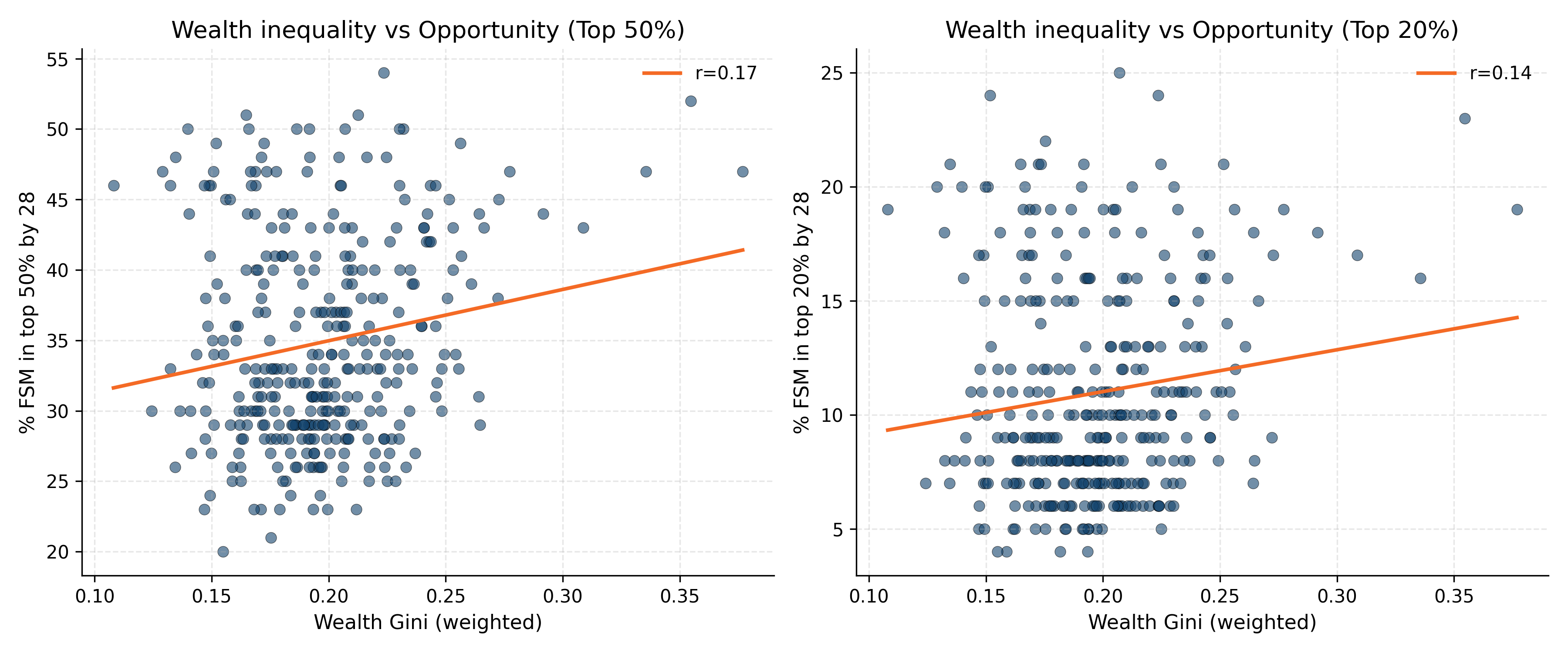
Finally, I compared wealth inequality (house price Ginis) to measures of social mobility from the Opportunity Index of Sutton Trust. Why make this comparison? Because inequality matters most when it affects opportunity. Classic economic theory (shoutout to the Great Gatsby Curve!) may tell us that high inequality can translate into barriers to mobility - fewer rungs on the ladder, or rungs spaced further apart. Wealth inequality is particularly relevant here: housing markets shape where families live, what schools children attend, and what networks they can access. If house prices are highly unequal within an area, poorer households may be priced out of high-opportunity neighborhoods, reinforcing disadvantage. (The counterargument may be though that high inequality can offer strong incentives to mobility but let’s just ignore for now…).
The weak correlation in the data below between those in the top of economic mobility and wealth inequality suggests that, at least in the UK context, the story is more complicated. Inequality is rising, but it doesn’t translate neatly into local mobility outcomes - perhaps because other factors (schools, transport, policy, social capital) intervene.
In sum, local inequality in the UK is hard to measure - and my analysis is at best a second-best attempt. Still, the patterns are clear enough to raise questions and merit further research with better data: inequality has risen in many places - even more when you look at wealth, but the relationship with opportunity is weaker than you might expect.
How to move on/improve?
Beyond the brief analysis I just did, there are some slightly more time-consuming data-driven ways forward to improve from what I just did:
Small-area estimation: Borrow ONS’s trick - combine surveys with census covariates in hierarchical Bayesian models to map inequality down to the MSOA level using richer census covariates for sparse data. But do remember: garbage in, is still garbage out!
Distributional national accounts: Align survey microdata with ONS macro totals for consistent, spatially differentiated inequality measures (e.g., by reweighting and scaling household survey data).
Spatial econometrics: Model inequality with spatial lags (e.g., spatial weight matrix using contiguity or k-nearest neighbors), because Croydon and Surrey aren’t islands - apparently.
And perhaps being a bit creative here, some of my ideas beyond the usual toolbox:
AI/NLP (how can I write a substack without mentioning an AI option?): The idea is simple: scrape the stuff local life produces in text - council reports, housing ads, planning applications, job postings. Then train and fine-tune a LLM to score how often words cluster around “affordability/struggling/basic” versus “luxury/exclusive/premium.” Aggregate those scores across space and time at the MSOA/LSOA level, and you suddenly have a perceived inequality index: what landlords, councils, and employers are signalling about local economic conditions. It’s noisy, sure, but as a complement to hard numbers it captures the “vibe” of inequality that surveys and tax records can’t.
Computer vision on street-level imagery. With Google Street View or Mapillary frames, you can train object-detection and classification models (YOLO, ResNet, ViT) to quantify visible inequality: housing type and façade condition, roof and window upkeep, tree cover, cars (old hatchbacks vs new SUVs), retail frontage (pawn shops vs cafés), even security cues like shutters or CCTV. Aggregated to MSOA/LSOA level, these features become a visual deprivation index or streetscape asset index, which can be tracked over time by pulling older vs newer imagery. Validation against IMD, house-price Ginis, or FSM rates shows whether the proxies work. It’s not perfect, but it turns what you can literally see on the street into measurable local inequality.
Transaction data: Anonymised card spending or retail footfall feeds (think Visa/Mastercard, bank APIs, or mobile location data) can be aggregated to MSOA/LSOA to capture consumption inequality - how often households eat out, travel, or buy discretionary goods versus only essentials. With large-N, privacy-preserving aggregation (k-anonymity thresholds, differential privacy noise), you can track local consumption divides at monthly frequency. This provides a high-resolution, behaviour-based proxy for inequality.
📌 And credit where it’s due: the only real UK local inequality measure I’ve found in practice is Joel Suss’s one-off Zoopla-based study - proof that creative data proxies can work.
Why this matter - and moving forward
Inequality numbers look neat in a textbook, but measuring them in practice is messy, contested, and often misleading. Inequality measures shape policy debates, yet most of the tools we use are blunt, inconsistent, and too often divorced from how inequality is actually lived. Without better data, we’ll keep patching together proxies and hoping for the best - and politicians will keep cherry-picking whichever measure suits them.
Still, the toolbox is expanding. From Bayesian small-area estimation to computer vision and AI-based perception proxies, we can now push beyond national averages and get closer to how inequality plays out locally. But let’s be honest: the real breakthrough would be direct access to granular tax data, combined with other sources, to anchor everything else.
So if you’re reading this at ONS: unlock the data, and I promise I’ll turn it into public insight rather than private mischief. Think of me as a responsible borrower - lend me the data, and I’ll return insight.